Here's How Parallax Design Can Boost Your Website
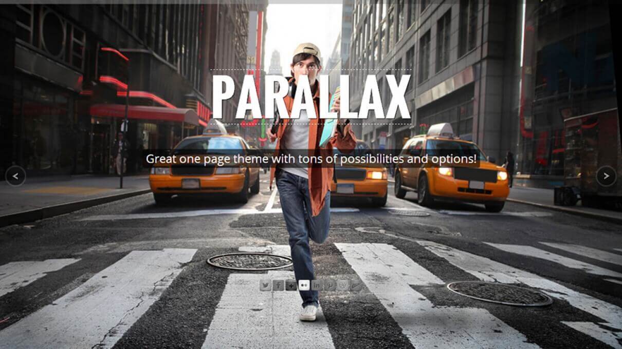
In a blog post we wrote a few months ago on Good Website Design Principles for 2013, we mentioned parallax websites as a trend that is really catching on. Parallax websites are attractive and they add an artistic dimension to your website. Done properly, parallax structure makes your website pop, giving you an edge over the competition.
Some History Behind Parallax
The parallax technique is not a new concept and it has been around since the 1940s when it was used to create an illusion of depth in 2D video games. In the 1980s, the technique grew in popularity with the boom of arcade games.
A few years back, parallax structure became popular for websites with the arrival of CSS3 and HTML5 in browsers, making it easy to create and manipulate this effect in web design.
So What is the Parallax Structure?
In brief, parallax structure consists of layers within a webpage, where the background moves at a slower rate than the foreground, creating a 3D effect as you scroll down a page.
This 3D effect and the illusion of depth is attractive and visually captivating for the viewers, making the website intriguing by piquing the curiosity of the viewer to stay on the page and see more.
Websites using parallax structure are becoming more and more popular as people’s expectations of what websites should look like and the experiences they should provide are changing and rising.
How can Parallax Design Boost your Web Presence?
There are so many benefits for parallax websites. Here are five we think are important.
- In addition to being popular and exciting, parallax web design has a lot of benefits and can boost your online presence, drive traffic towards your website and create a lasting impression in viewers’ minds. Parallax web design will keep viewers hooked on your webpage far longer than a regular page can.
- The layer and depth effect and illusion of parallax web design creates an element of surprise for the viewer, making the experience of browsing a website more engaging and memorable.
- The parallax web design structure allows you to tell a story that your viewers can follow and interact with. You can allow your readers to have fun on your page and engage with your content in a way that will guarantee maximum absorption of what you want your web viewers to get out of your page.
- The 3D effect allows you to showcase your products in an attractive and interesting way on your website, giving your viewers the freedom to explore your products for themselves. The attractive design will ensure that viewers take the time to check out what you have to offer.
- With parallax design, an entire website can reside on one page; this will get rid of complex navigation structures by allowing you to display all your content and website structure on one page. As viewers scroll down your page, they will see everything you want them to see – without risking having them bounce off to other websites without browsing through all the sections of your websites before they leave.
Can you imagine how useful parallax structure can be for displaying your online portfolio, showcase your products, pictures, menus and so much more?
A word of warning… although parallax web design is exciting and appealing, do not overdo it. Too much parallax that serves no particular purpose can be disorienting to your viewers and detrimental to your website.
As with any other element of design, make sure your purpose is served by just the right amount and style – parallax structure included.
Here are some tutorials to get help you create parallax structure for your website.
- http://net.tutsplus.com/tutorials/html-css-techniques/simple-parallax-scrolling-technique/
- http://f6design.com/journal/2011/08/06/build-a-parallax-scrolling-website-interface-with-jquery-and-css/
- http://www.techrepublic.com/blog/web-designer/tutorial-how-to-implement-the-parallax-scrolling-effect-part-1/
- http://everetdale.com/parallax-scrolling-tutorial/
- http://abduzeedo.com/super-easy-parallax-effect-jquery


