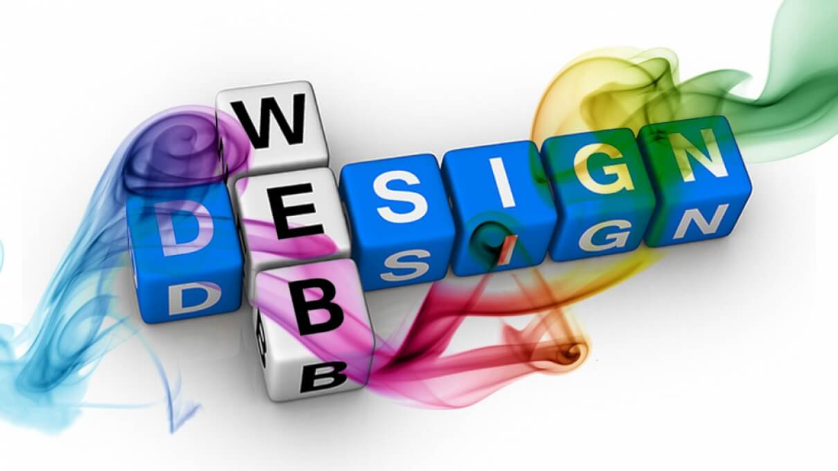
Fashionable Web Design: The Strip Down
With the advent of new technologies, new technical needs and what people want to see, how people use their mobile phones, how people view or want their information, the web has to adapt to fit the new purposes, to adapt to people’s needs and demands and not vice versa.
Because web browsing is no longer confined to a seated position in front of a computer screen or laptop, websites have to adapt to become viewable on the relatively smaller mobile phone screens. In addition to that, because the web is so full of information, it is unlikely that people will take the time to browse a single website looking for useful information. If a website’s usefulness in terms of content does not immediately pop out on the screen, then the viewer will bounce to another website in a few seconds. Keeping all these things in mind, the shifts in web design trends become obvious and inevitable. The natural progression of websites towards simplicity, cross-platform compatibility and focus on content first is nothing short of predictable and natural.
In this blog post we will attempt to summarize the elements involved in this new trend of website design. There is no shortage of information on the web relating to this topic; we will attempt to provide you with as succinct and as comprehensive a view of new trends in web design as possible.
Based on our research and observations, we managed to categorize all elements of web design for 2013 into 3 interrelated categories: Content, Display and Technology.
Content
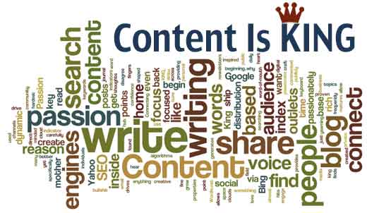
Content is king. The internet, now more than ever, is the place to go for information of any kind, from recent scientific theories to gardening tips to online shopping for socks. The number of websites available has skyrocketed in the past few years and according to the Google Index there are around 45 billion webpages available on the net. Can you imagine the amount of information available in all these pages? Even with the dead sites, spam pages and other useless sources, the amount of content is staggering.
In light of this it is no longer acceptable or smart to ignore the content element of a website. After all, people browsing the net are there to find information and not only to look at the aesthetics of a website or webpage. In 2013, the focus on content is what drives other elements of good web design, such as display and technologies used in designing and developing a website. After all, the whole point is to make content available and easily accessible in order to grab viewers’ attention and keep them on a page.
Display
The design and display of a website in 2013 is centered on content and its purpose is to make content stand out. People often ‘linger’ on a webpage for no longer than 10-20 seconds before “bouncing” to another website in their search for information. A smart website design that displays content in a clear and attractive fashion can increase the chance of people staying longer on a webpage and even bookmarking it or returning to it later. We need to keep in mind that the focus is on the user, the user’s needs, the user’s experience in the online search for content of any kind. A few points to keep in mind:
- Simplifying design and interactions on a webpage to make content stand out and be as accessible as possible.
- Using UX centered design, in other words keeping in mind how users might use the website, their point of view and their experience.
- Using flat colors, flat designs and creating clear layouts that allow the user to browse the content of the webpage easily with minimum distractions.
- Including social media badges on all webpages to cater to the way users browse the web and share information these days.
- Creating fixed header bars and floating bars with important links (such as links to other pages on the website) and social media badges that people usually access. These allow people to scroll down as much as they want and still have certain buttons and features at their fingertips without scrolling back up. Remember, users lack patience while browsing online.
- Designing websites with large photo backgrounds, creating a cinematic effect.
- Designing websites to allow infinite scrolling and sliding panels. This gives the reader the sense of continuity in content without the ‘hassle’ of clicking “next”, “go to next page” and so on.
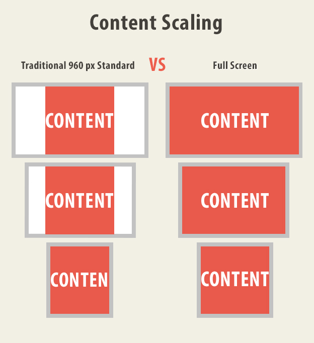
- Scaling content to full screen view as opposed to the traditional standard 960 pixels view.
Technology

To make all the above possible, certain technological, styling and language facts need to be kept in mind.
- Unifying desktop and mobile versions as more and more people now browse the net on their smartphones looking for information of any kind. Websites must be adequately displayed on mobile phone screens as on computers screens.
- Creating app style interfaces that help unify and simplify content and reflect the way people use their smartphones daily, hence making your website and webpages as accessible to users as the Facebook mobile app is.
- Adapting and integrating device sensors, touch enabled interfaces and speech-based interfaces into the design.
- Coding using HTML5 and CSS3 and J-Query to create the effects we talked about above: simplicity of design, colors and interaction.
To wrap up, new trends in web design are going for more simplicity with the focus being mostly on content and creative and accessible ways of displaying it. Simplicity in our opinion in no way means boring pages, as some of the examples we included here can testify.