Flipboard, Currents and Pulse: A Brief Comparison
The way we receive and read the news has changed drastically in the past few years. With the increased use of mobile phones for web browsing, reading and business, the news world is also in on the race.
Add to that the fact that the Internet is an increasingly social place, and sharing news, stories and interesting articles is part and parcel of our everyday lives.
To help you get your news of choice, organize that news and share it with your friends and contacts on social media networks, you have applications like Flipboard, Google Currents and Pulse.
This article is going to compare several features of these three apps in the hope that it will become easier for you to make an informed decision as to which is best. We'll tell you which one we prefer as well!
As the name suggests, the app allows you to flip through articles as well as through pages of an article. The flip feature does not always work for all articles and news providers though. For some you have to scroll or redirect to the web version of the article to read it. This can be a bit annoying as you feel a lack of consistency and, well, you might miss the practicality of the flip feature.
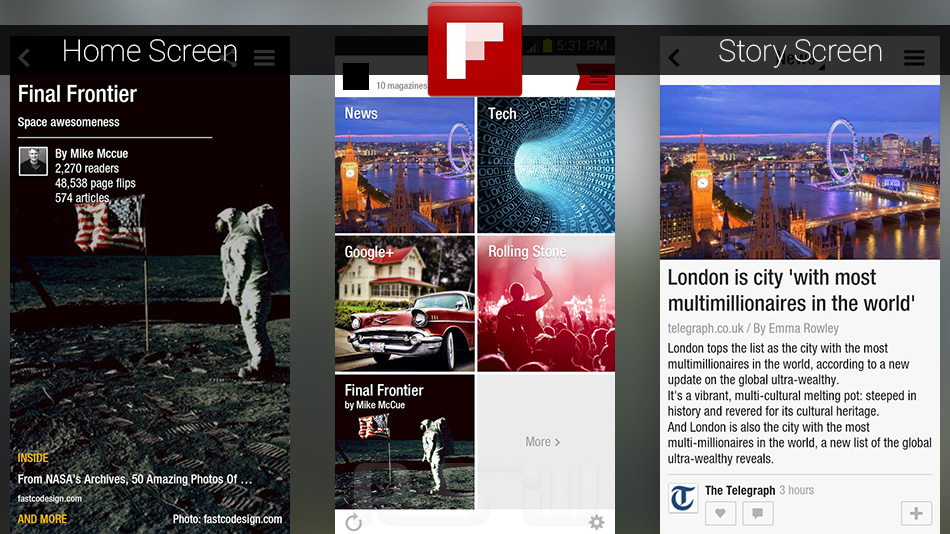
Flipboard allows for multiple sign-ins, like with your Facebook and Twitter accounts. Then Flipboard brings your social feeds into the app. This is a good feature of the app making bringing all the news you want to one place.
One feature that is less than ideal is that once you choose a news provider, you can only see one article at a time on the page. You cannot browse with a glance and choose what to read, you have to flip through the articles one by one before settling down to enjoy one.
An interesting feature is Flipboard Picks, which automatically chooses interesting and trending articles and displays them for you, keeping you in touch with important news around the world.
The sharing tools on Flipboard offer the opportunity to share articles and stories you are reading using many different applications.
Google Currents
In Currents you swipe left and right to move between pages and articles. You can also move between categories with a swipe.
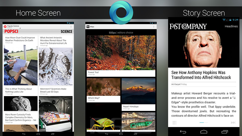
Unlike Flipboard, Currents only brings you stories and articles from news sources you subscribe to. No social feeds connected.
Currents shows you multiple items from a news provider on the same page to allow you to view different articles before choosing one to read. In this, Currents is better than Flipboard as it saves time in browsing.
Curprents has tabs like Recommended and Pick of the Week that put trending and interesting articles in one place for you to read. This is similar to Flipboard Picks and is a feature we find particularly interesting.
Much like Flipboard, Currents also offers powerful and extensive sharing tools that allow you to share articles and stories you are reading to various applications.
Pulse
In Pulse you scroll from top to bottom to read a post or to view different categories, and you swipe horizontally to switch between articles. In this way a Pulse page shows nine article thumbnails from three different news providers on one page making it easy to get a broad idea before you choose what to read.
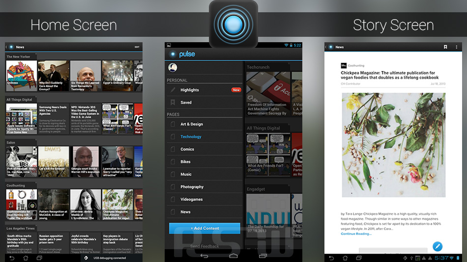
Although having so many news items on one page might be useful, it makes the page look very crowded, and we think that detracts somewhat from its value.
One interesting feature of Pulse is that it gives you the choice to read articles and stories against a white or black background, allowing you to have some control over the app’s interface for your convenience.
Pulse has a Recommended section based on your own online behavior and your patterns of preference – slightly different concept than Picks and Recommended on Flipboard and Currents.
Finally, Pulse allows you to connect using Facebook, Twitter and Linkedin and share the articles and stories you like onto these platforms.
Here's how we see it:
Flipboard and Currents both have great, easy on the eye and easy to browse interfaces - Pulse suffers on this point.
All three applications are adequate in terms of news sources and allowing you pick what you wish to subscribe to.
We love the sharing tools provided by Flipboard and Currents - Pulse, not so much.
Currents beats Flipboard in that it shows you several news items from one source on the same page. But otherwise these two apps are equally efficient and great to use in our opinion.
Now to you. Which do you think is the best application of the three? Tell us why in the comments section!
